
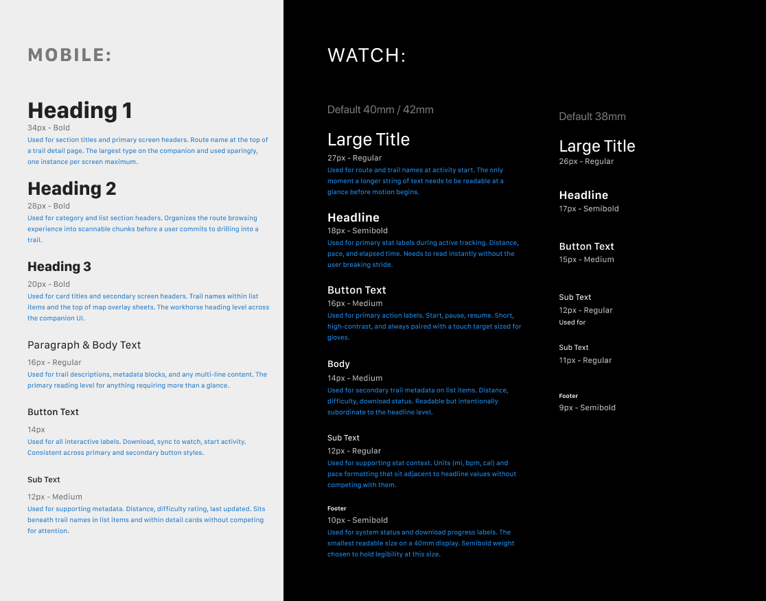
S
J


OnX Maps
An Apple Watch navigation MVP that validated the companion model, surfaced a high-intent user segment, and clarified where wearable investment actually belongs.
Lead Product Designer
Apple Watch
WatchOS
iOS
R&D
App Design
Map
Navigation
Overview:
OnX's backcountry users were already hitting the core limitation. Checking position, confirming a route, or reading navigation status required stopping, pulling out a phone, and breaking focus from the trail. In environments where that kind of attention split has real consequences, that's not a UX inconvenience. It's a product gap.
Competitors had started closing that gap with wearable apps, and OnX users were noticing. That competitive pressure, combined with user feedback, created a clear signal that doing nothing wasn't an option.
But expanding into watchOS came with significant investment risk. Each OnX flagship serves a distinct user group with a distinct feature set, which meant wearable support couldn't be built once and reused without careful scoping. Building the wrong features, or overbuilding too early, would introduce development cost, battery risk for users, and long-term maintenance overhead that didn't pay off. The goal of this project was to validate whether wearable navigation belonged in the OnX ecosystem at all, and if so, which features genuinely justified the investment.
I led end-to-end design of the watchOS MVP, from initial scope definition through alpha launch and evaluation. That meant defining what belonged on the wrist versus the phone, navigating hard constraints around data quality, timeline, and platform limits, and advocating for decisions that would generate real signal rather than just ship something. A secondary objective was testing integration of a recently acquired UGC database, the Hiking Project, to enrich navigation data across the broader platform.
What launched wasn't a flagship. It was a focused research vehicle designed to answer specific questions about platform fit, user behavior, and whether wearable navigation could genuinely extend the OnX ecosystem.

Role:
Senior Product Designer
Platform:
Apple Watch - iOS - App
Core Contributions:
UX/UI Direction, Research synthesis, feature strategy, user flows, watch UX/UI, app UX/UI, design system creation, product roadmap.
Impact
Designed and launched app
Launched a research and development Apple Watch navigation experience with partner app that validated glance-based trail use and uncovered an emerging trail runner user base.
Research and development
Tested user flows, interactions, and early subscription willingness within a wearable context.
Scalable System
Delivered insights that directly influenced mobile map architecture decisions and clarified how OnX approaches ecosystem boundaries between wearable and phone experiences.
What we were up against


01
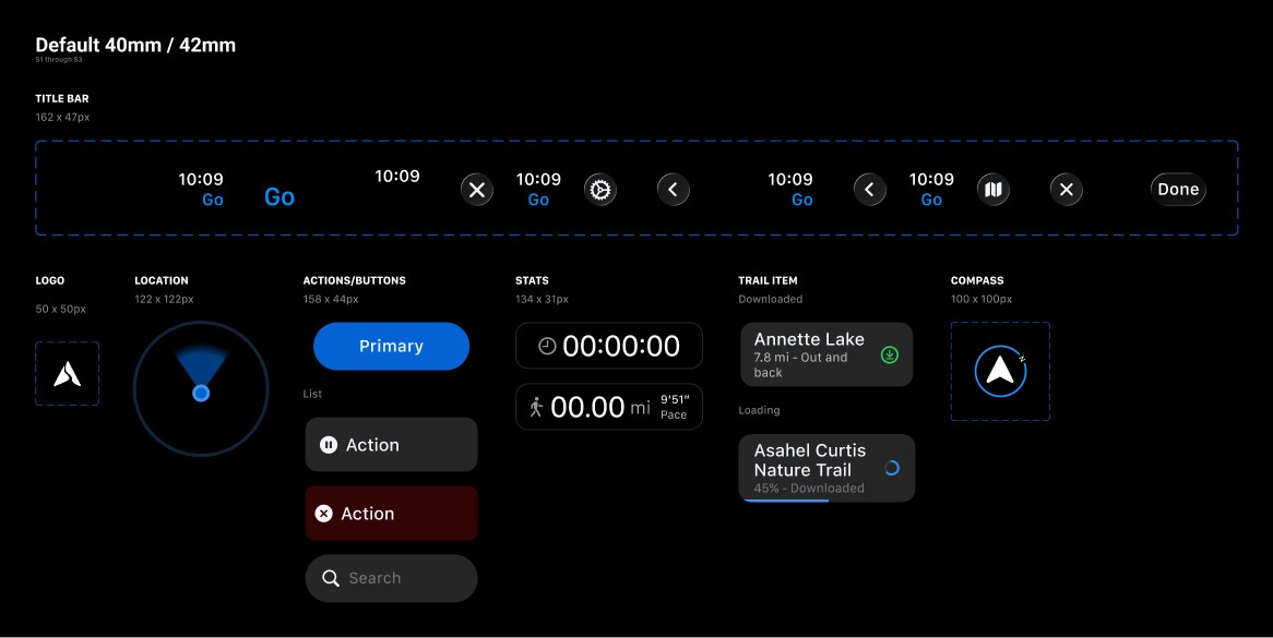
Platform limits that don't negotiate
Tiny screen real estate, no cellular in backcountry, aggressive battery drain from GPS polling, and multiple watch sizes to accommodate. The hardware created hard ceilings on information density and interaction depth from day one.
02
A data source decision I flagged and lost
Leadership chose the Hiking Project database over OnX's Backcountry dataset to accelerate development. I pushed back on the architectural implications early. When the decision held, the design strategy adapted around it, but the ceiling it created on map richness and turn-by-turn viability shaped the product in ways that weren't fully visible until mid-build.
03
Timeline pressure at every phase
Less than three months from concept to alpha. That meant building something functional, not polished, and making explicit, intentional tradeoffs between depth and speed at every stage. Production quality and reliability took consistent effort to maintain throughout.
04
Scope ambiguity from the start
The hardest constraint wasn't technical. It was determining which features genuinely belonged on a wrist versus what was merely possible. Without that clarity early, scope would have sprawled and the signal from testing would have been harder to read.
What we were up against
Good design doesn't start polished. It starts fast. The first priority was getting structure into testing before anything was precious: hierarchy, orientation, core actions. The visual language came later, after users told us what was actually working.

Early exploration
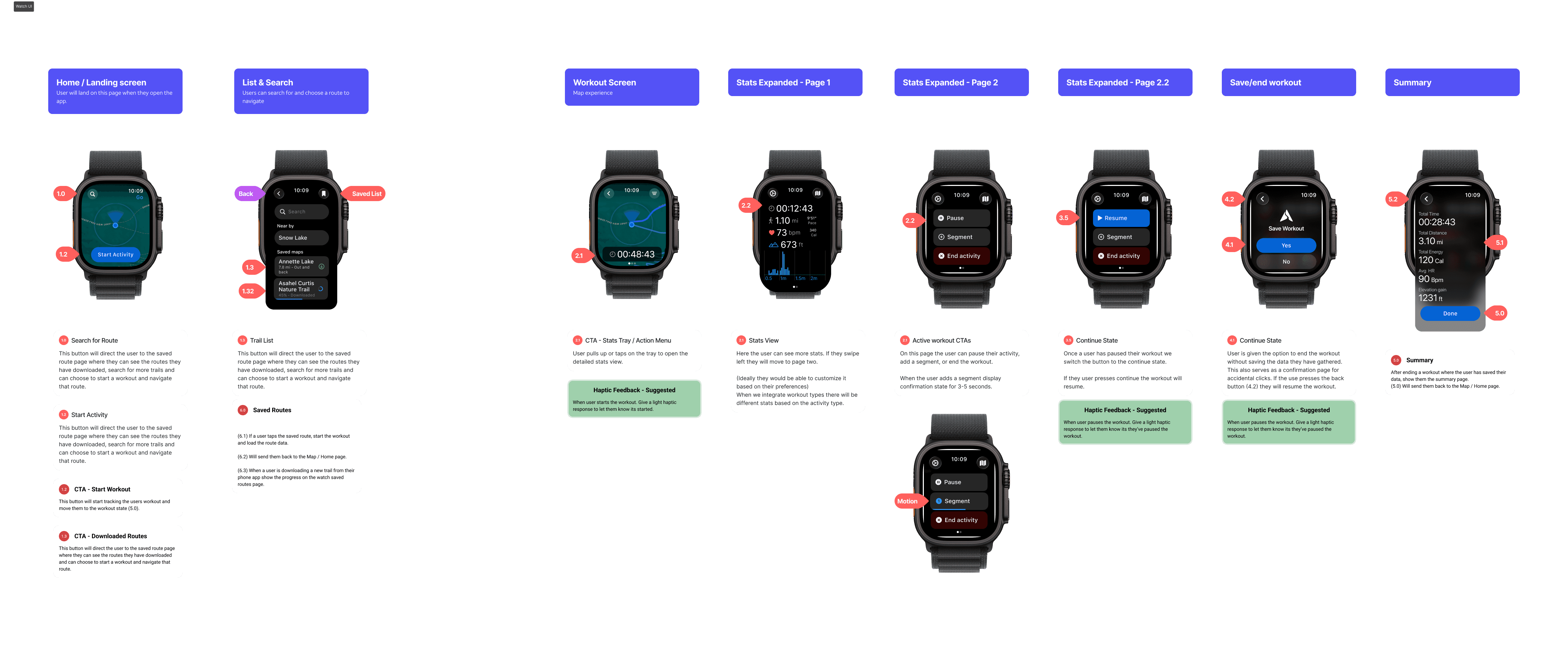
The wireframe
Getting structure out of our heads and into testing. Navigation hierarchy, core actions, map placement. Nothing here is precious. It's a starting point designed to be wrong in useful ways.
First testable build
Mid-fidelity
Real hardware, real map data, real users. North-up orientation and stats overlaid on the map surface. Testing surfaced both as problems. Users couldn't orient quickly while moving and the stat placement created visual competition with the map.
Designed with signal
Final
Map orientation and stat placement were resolved through testing. With the UX settled, the work shifted to visual language: color, hierarchy, and making it feel like something worth wearing.
Defining the ecosystem split
Product strategy & scope
The core design challenge wasn't what to build; it was where each feature belonged. Establishing a clear boundary between watch and phone was the most important structural decision of the project.
Apple Watch
The navigation surface
Map view — glanceable, north-up orientation optimized for active use
Activity stats — distance, duration, elevation, pace, heart rate via Apple Health
Trail path visibility — route and progress visible during active navigation
Activity segments — added post-testing to serve trail runners tracking performance splits
iPhone Companion
Planning & management
Route discovery — browse, filter, and download trails for offline watch use
Map download & sync — push offline map areas to the watch pre-activity
UGC trail feedback — surface and contribute to the Hiking Project dataset
Account, settings & activity history — everything that required a larger screen

Principles
Principle 01
Glanceability first
Every screen designed to communicate in under 3 seconds on a moving wrist.
Principle 02
Clarity over customization
No toggles, preferences, or configuration. Defaults had to be right for the context.
Principle 03
Ecosystem alignment
Every watch feature had to make sense as an extension of the phone experience, not a replacement.
Principle 04
Complexity lives on mobile
If it took more than a few taps or required sustained attention, it belonged on the phone.
Information Architecture
Watch & mobile user flows
The IA split between watch and mobile was one of the first structural decisions we made, and one of the most frequently challenged. Every feature request had to pass through this filter before it got further investment.

Watch
Mobile
Where the product got defined
Decisions that shaped the outcome

Decision 01
Companion, not standalone
The call
Early exploration treated the watch as a potential standalone navigation product. I reframed it as a companion surface from the start, one that extended the phone rather than replicated it. That framing became the filter for every scope decision that followed.
Why it mattered
A standalone framing would have chased feature parity with the phone, a target the platform couldn't support and users didn't need. The companion model kept scope honest and gave every descope decision a clear rationale. Real-time navigation on the wrist, everything else on the phone. Without that framing, the product would have tried to do too much and done none of it well.
Decision 02
Design around the data you have
The call
Leadership chose to build on the Hiking Project database rather than OnX's Backcountry dataset. I flagged the architectural and feature implications early. When the decision held, the design strategy adapted, leaning into UGC experimentation and removing features that required high-confidence trail data to be trustworthy.
Why it mattered
Features like turn-by-turn directions and trail progress tracking weren't removed because they were hard to design. They were removed because the underlying data couldn't support the trust level those features require in a navigation context. Flagging that early prevented over-commitment to the roadmap and protected users from guidance we couldn't stand behind.


Decision 03
Monetization timing is a product decision
The call
I advocated for delaying the subscription paywall until the core experience had enough reps to justify recurring payment. The $2.99/month model was introduced during the alpha phase, earlier than I recommended. My position was that users can't fairly evaluate value on a product they've barely had time to use.
Why it mattered
Pricing a product before it's ready doesn't just affect revenue; it changes what you learn. Alpha users evaluating the app through a pricing lens couldn't give clean signal about the product itself. Adoption plateaued and it became difficult to separate product problems from pricing problems. The lesson I carry forward: monetization timing has design consequences, and it needs design input before the decision is made.
How the core experience came together
Core map UX decisions
Shipping on time with a focused feature set required active scope management throughout. Some cuts were deliberate strategic choices; others were forced by technical constraints discovered mid-build.

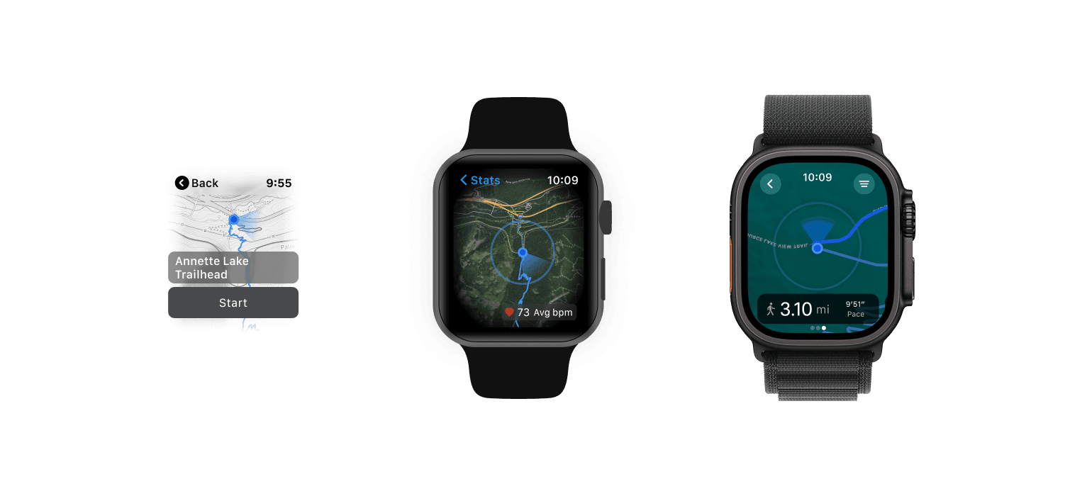
Heading-up orientation
The map rotates to match the direction the top of the device is facing, so what's ahead of you is always at the top of the screen. This eliminated the mental translation users had to make between the map and the real world while moving. A fixed north-up map forces the user to reorient their thinking every time they change direction. At a glance on a wrist, that cost is too high.
Crown button for zoom
The Digital Crown controls zoom level on the map. Rather than using a pinch gesture that would require two hands and full attention, rotating the crown keeps one hand free and eyes on the terrain. It also avoids accidental map interaction while moving. The crown is the watch's most precise physical input and it was the right fit for a continuous action like zooming that users needed during active navigation.
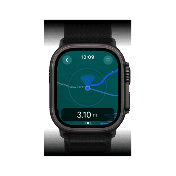
Persistent stats on the map view
Distance, time, and heart rate sit in a fixed bar at the bottom of the map screen rather than requiring a swipe to a separate stats face. Users in active navigation need positional context and performance data simultaneously. Separating them into different screens created unnecessary friction during the moments that mattered most.
Touch interactions: pan and tap
Dragging on the map surface pans around it, letting users look ahead on a route or check terrain without leaving the map view. Tapping on the stats bar at the bottom switches to the full stats face, showing distance, pace, elevation, and heart rate in a larger format. Tapping back returns to the map. Two modes, one tap to toggle between them, no nested navigation required. The interaction model had to be learnable in under ten seconds with gloves on.
What we considered building
Feature exploration
We explored a wide range of ideas before deciding what belonged in the MVP. The challenge wasn't generating features; it was determining which ones truly belonged on a wrist, and which were technically feasible within the constraints we had.


Route pathing and path history
The map renders two distinct lines simultaneously: the planned route ahead and a breadcrumb trail showing exactly where the user has already traveled. In backcountry navigation, knowing where you came from is as important as knowing where you're going, particularly if you need to retrace your steps or identify where you left the trail. Both lines stay visible without any interaction.

Activity stats & Apple Health
Distance, duration, pace, elevation, and heart rate pulled from Apple Health. Initially treated as secondary; trail runner behavioral data elevated these to core watch features. A larger, high-contrast stats view was added for readability while moving.

Activity segments
Not in the original scope. Trail runners surfaced through behavioral data during the alpha wanted to split activities into segments to measure performance across specific trail sections. Added directly from watch actions without interrupting the core tracking flow.

Group Tracking
We explored real-time group tracking to support shared outings. This proved technically complex in low-connectivity environments and conflicted with our primary offline use case. It was ultimately deprioritized for the MVP.

Turn-by-turn trail directions
Would have shown directional cues when a trail forked and guided users back if they strayed from the route. The Hiking Project database couldn't provide accurate enough trail direction data or detect reverse routing reliably. Trust in navigation is non-negotiable, so we pulled it rather than ship something unreliable.
What testing changed
Assumptions vs. reality
Closed alpha testing and early user feedback challenged several things we thought we understood. Four adaptations had the most meaningful impact on the final product.
Assumption
Users could infer spatial scale from the map alone
We believed the map view provided enough visual context — even on a small display — for users to understand distance and terrain while moving.
What we changed
Added a visual scale indicator
Users frequently misjudged distance and terrain while moving. We added a static scale bar directly to the map view. It reduced spatial ambiguity, improved navigation confidence, and added zero interaction cost.

Assumption
Saved routes was the right entry point for the companion app
We launched the mobile companion with a saved routes landing page — the assumption being that users wanted to manage content before heading out.
What we changed
Shifted to a map-first entry experience
Users wanted immediate access to the map to explore nearby routes. The content-first entry created unnecessary friction before they could see anything useful.


Assumption
Waypoint creation would be a core, premium watch feature
We scoped waypoint dropping as a key capability — the kind of power-user feature that could justify a subscription tier.
What we changed
Removed from MVP entirely
Users didn't see waypoint creation on the watch as valuable or worth paying for. Most preferred managing this before or after a hike on a larger screen. Removing it kept the watch experience focused on high-impact, in-context actions.

Assumption
Hikes and trail runs were the same use case
Our initial model treated all outdoor activities as a single continuous tracking experience with the same data needs.
What we changed
Added activity segments for trail runners
Behavioral data revealed trail runners as a distinct, high-intent segment who wanted to measure performance across specific trail portions. Segment tracking — created directly from watch actions — made the product significantly more valuable for this group.
Scope & tradeoffs
What didn't ship and why
Shipping on time with a focused feature set required active scope management throughout. Some cuts were deliberate strategic choices; others were forced by technical constraints discovered mid-build.
Intentionally not built
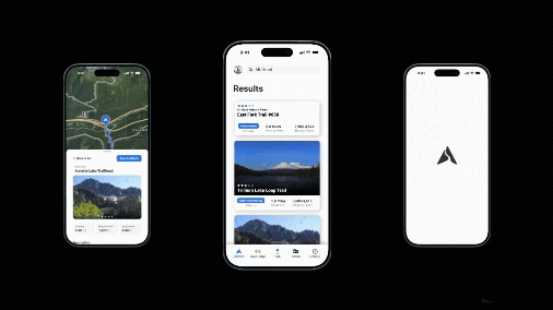
Full-featured mobile companion:
The goal was to validate the watch experience itself. A robust mobile planning ecosystem was explicitly out of scope. The companion app remained secondary — supporting sign-in, map sync, and basic account management only.
Waypoint management
Testing and market research confirmed this wasn't a meaningful feature for most users in the moment. Deprioritized until there's a clear signal that users want it and are willing to pay for it.


Descoped due to constraints
Trail progress indicator
Showing how far along a route a user had traveled was a high-value idea — but data accuracy inconsistencies and edge cases introduced too much risk. In a navigation product, a misleading progress indicator is worse than no indicator. Advocated to bring it back post-launch.
Group tracking
Engineering couldn't find a reliable mechanism to share tracking data in low or no-connectivity environments. Given the offline-first requirement, this was a fundamental incompatibility — not an implementation challenge to solve later.
Turn-by-turn trail directions
The Hiking Project database lacked the accuracy required to detect trail forks reliably or determine if a user was traversing a route in reverse. Shipping directions with unreliable data would have damaged trust at exactly the wrong moment.
Delivery
From design to build
Design doesn't end at handoff. The companion app and watch experience were documented in detail, covering gesture hierarchy, state transitions, and edge cases specific to offline and GPS-uncertain environments. The goal was to protect interaction quality through build, not just describe it.
Companion app
Planning belongs on mobile
Documentation strategy
Redlines & edge case documentation
Visual craft
Visual system and design language
The watch forced every visual decision to be intentional. At 44mm there's no room for decoration, no space for ambiguity, and no tolerance for a hierarchy that isn't immediately clear. The system built here reflects that.
Typography
Two surfaces, one system
Typography on a wrist isn't a scaling problem, it's a trust problem. If a user can't read their distance at a glance while moving, the product fails at its most basic job. Every decision in this system started from that constraint and worked outward.
The companion app and the watch share a visual language but not a type scale. Each was built from scratch for its surface, with its own hierarchy, its own floor, and its own ceiling. Nothing was adapted or assumed to carry over.
UI components
Design System
What came out of it
Impact and results
The project was designed to generate signal, not to be a flagship. It did exactly that, and the signal shaped real decisions.


Insight & Takeaways
The most durable output of this project wasn't a shipped feature. It was clarity. We knew going in that we were validating platform fit, not building a flagship. The signal we got, that the companion model works, that trail runners are a high-value wearable segment, and that standalone subscription needed more product maturity before it could stick, gave onX a confident basis for decisions that came after. That's what a well-scoped MVP is supposed to do.
Looking back
Reflection

What made it hard
The constraints didn't arrive sequentially
Platform limits, a compromised data source, a compressed timeline, and a monetization decision I disagreed with weren't problems that appeared one at a time. They were all active simultaneously. The hardest calls weren't about the interface; they were about what not to build, when to escalate, and how to hold a clear enough position to make those calls stick across multiple rounds of stakeholder pushback.
What I'd do differently
Commit to the trail runner segment earlier
Behavioral data pointed there within the first few weeks of alpha, with high session frequency, strong completion rates, clear demand for segment tracking. I'd push harder and earlier to make trail runners the primary design target, rather than continuing to serve a broader, less committed audience that diluted the product's value proposition and made scope decisions harder to sequence
What this project shows
Judgment under constraint, not just execution
This project required holding a product direction steady while the data source changed, the monetization model was introduced too early, and the target user turned out to be someone we hadn't originally designed for. The work that mattered wasn't the screens; it was knowing which constraints were load-bearing, which decisions needed design input before they were made, and how to extract useful signal from a product that didn't hit its commercial target.


